Michael's TeXronomicon (LaTeX tips, tricks, and hacks)
Loading post stats...
Between my mild presentational OCD and a desire to understand how various cool figures, tables, and styles have been implemented in other groups' papers, I have accumulated quite a few LaTeX snippets that I pass around with my friends. I figured I should put them all in one place along with some explanations, so (if you're interested) you can learn to make your own.
You should probably check out the TOC to decide which parts you want to read. There will probably be parts you already know; I am covering basics here so I can give this to a new author. To briefly explain the structure, I will discuss:
- How commands work, how to make them, and the right way to do comment commands.
- Text styling, including coloring, highlighting, citation styles, exotic symbols, non-Latin alphabets, and inline graphics/icons.
- Table styling and formatting, which packages you should use, special symbols to make tables more readable, and making text compact.
- The dark arts, how you can break free from the bounds of conference
.styfiles.
I might write more about within-document compound figure making and best-practices for generating readable plots in a follow-up post if there's interest.
- 1. Making commands
- 2. Doing text right
- 3. Turning the Tables
- 4. The Dark Arts (Advanced)
1. Making commands¶
You should probably be making more commands than you currently are. At their simplest, commands can let you reuse text or formatting easily, but they can do much more. First, a little bit about how to make them:
The two main command-making macros are \newcommand and \renewcommand.
If a command already exists, and you want to override its behavior, use \renewcommand. For example, I used \renewcommand to fix a critical flaw in the COLM format.
In the COLM format, this snippet:
1 | |
renders as:
Inertia is a property of matter Nye et al. (1995).
Instead of correctly rendering as:
Inertia is a property of matter (Nye et al., 1995).
In other words, the COLM format was treating \cite{} as \citet{} rather than \citep{}I know, I'm obnoxious ↩, as it is in all other conference formats.
With \renewcommand it's a one line fix:
1 | |
Comment commands¶
Almost everyone has used \newcommand for defining comment macros.
But are your comments hideable? Modular? Here's how I built up a more powerful drop-in comment command.
A typical, simple comment command is something like:
1 | |
This is nice and easy, but it has two issues. First, with more collaborators you have to define it over and over again, which looks gross.
1 2 3 4 5 | |
Ew.
But the more annoying issue is that inline comments mess up your text length and spacing. How are you gonna know how many pages you've written, and how well-aligned and spaced your figures and tables are, on the night before the deadline, if your paper is full of comments?
I fix both of these issues by implementing a base comment command that I build the other ones on top of, and adding a variable-based off switch that hides the comments.
1 2 3 4 5 6 7 8 9 10 11 12 13 | |
\newif\ifmyvariable defines a boolean variable, which is actually named myvariable.
You can control it with \myvariabletrue or \myvariablefalse.
Now, all I have to do to periodically check how the spacing and length of the paper is with a bunch of inline comments present is to make \commentsofftrue.
Fixing infuriating spacing issues¶
Often you want to define a command as a simple macro for some name you're using throughout the paper, say, for a contrived backronym method name. Something like:
1 | |
This has the benefit of letting you change it if you aren't sure what your final method is. Also if you want to use fancy coloring or fonts in your method nameAs I often do... , putting it in a comment is a must.
Unfortunately, text in LaTeX commands have infuriating spacing behavior. If you put the command as is, it will ignore trailing whitespace, so “\methodname is great” renders as “BiG-BiRdis great”.
The \xspace package makes spacing work right:
1 2 3 4 | |
2. Doing text right¶
With our new understanding of commands, we can turn to discussing best practices for working with existing commands and creating new commands to make your text look beautiful.
Additionally, we will talk about how navigate the various quirky “Knuth-isms”My tongue-in-cheek name for the many peculiar ways commands in TeX are written, often to enable extreme precision, whose existence make complete sense coming from the particularly detail-obsessed mind of its creator Don Knuth, pictured in the thumbnail (his typographical perfectionism drove the invention of TeX after all) that pervade LaTeX to make your text look right.
Citations¶
Two different styles of inline citation are invoked with \citet, and \citep.
In parenthetical citation styles (such as *ACL or COLM) these mean text-inline (\citet for text) and inside the parentheses (\citep).
Saxon et al. (2024) vs (Saxon et al. 2024)
One is used just as a source for a claim, the other is to write a sentence that the authors say X or authors do X.
Usually, \cite and \citep do the same thing. If they don't, I usually newcommand or renewcommand \cite to get this behavior.
ref, autoref, and cleveref¶
When you want to reference a figure or table by number you can use \ref{fig:figurename} to generate the figure number in a link like:
1 | |
generates
In figure 1 we learn X.
But what if you want the “figure” text to be part of the link? And what if you're sick of typing “figure” or “table” each time? There are two solutions, autoref and cleveref.
\autoref is the simpler command.
1 2 3 | |
Autoref works for figures, tables, sections, subsections, subsubsections, etc.
In subsubsection 2.3.1... Section 3 shows... See table 2...
Note that the first “figure” isn't capitalized, while the second is. “subsubsection” isn't capitalized but “Section” is. autoref automates all of this based on position in a sentence.
What if you want a more compact style of these automatic citations? What if you want to change this behavior? That's where cleveref can come in handy.
1 2 3 4 5 6 | |
The turbo encabulator (§2.3.1) also leverages inverse reactive current in unilateral phase detractors
Within those definitions you can define whatever behavior you want. You can make it say “Section 2.3.1” instead of “subsubsection 2.3.1”, enforce capitalization in all places, etc.
Quotation marks¶
Here's a great Knuthism:
The characters ' and ", in most fonts, specifically refer to backwards marks. So
1 | |
In the turbo encabulator power is generated by ”capacitive diractance” and ’magneto reluctance.’
Note the opening quotation marks are backwards. (This looks worse in the serif fonts most LaTeX documents use than it looks here.) To fix this, you need to use the tick mark `, not the apostrophe ', to open quotes.
1 | |
In the turbo encabulator power is generated by “capacitive diractance” and ‘magneto reluctance.’
Resizing and transforming text¶
There are various useful reasons you may want to resize text. Maybe to shrink an equation so it fits on a line, or to do some customization inside a figure or to shrink text in a table cell.
Text sizing is a site of many hilarious Knuthisms. First, to size a line of text, you use these (in ascending order of size)
\tiny\scriptsize\footnotesize\small\normalsize\large\Large\LARGE\huge\Huge
If you're just mad, you should say {\large I am mad} but if you're REALLY angry you can give a {\LARGE I AM FURIOUS}.
See more in Overleaf's docs
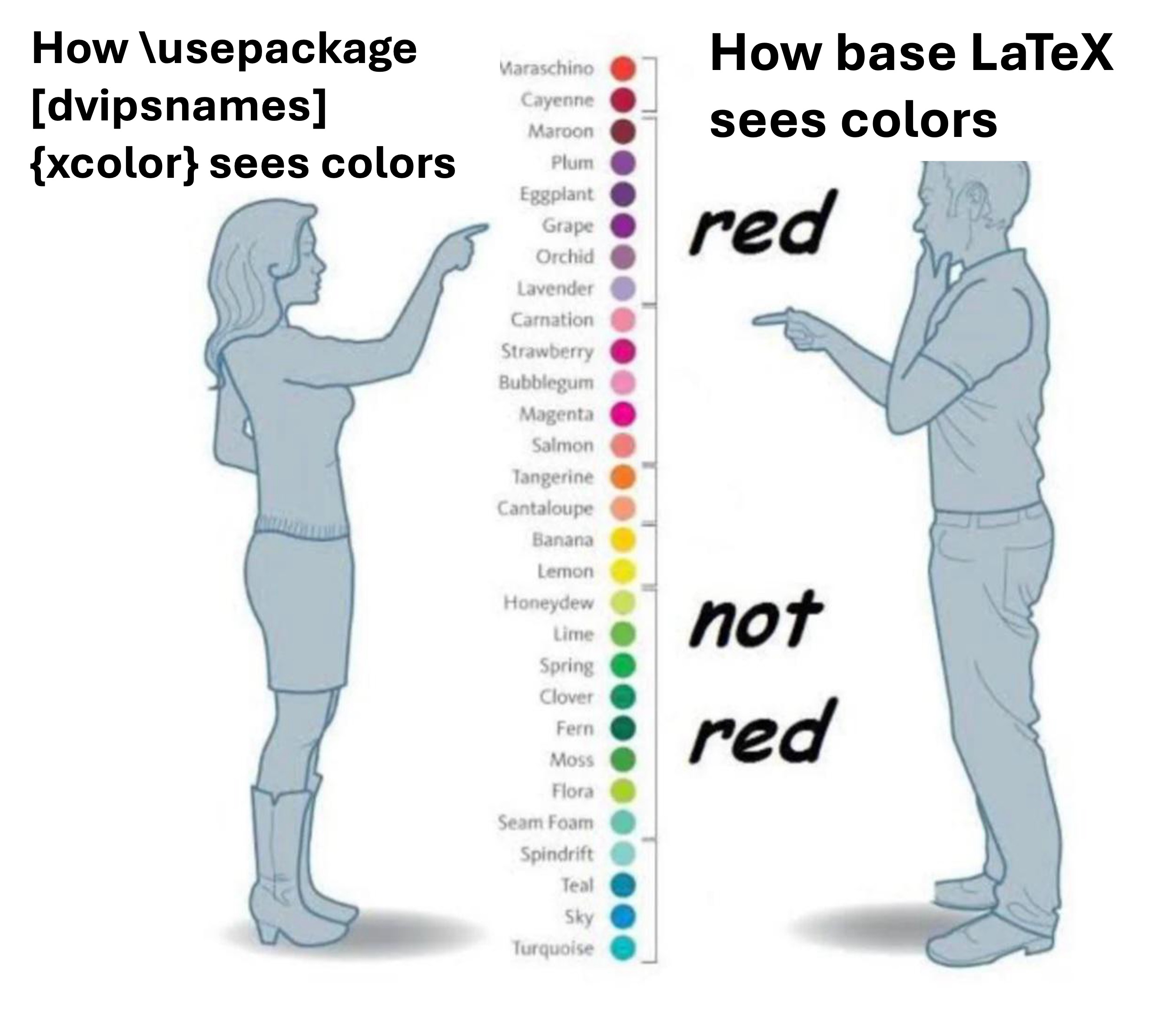
Defining colors and coloring text¶
By default, LaTeX has colors like “red”, “green”, “blue”, and “magenta” (as I used above in my comment commands).
However, the xcolor package is pretty much a must-use even with those colors defined.
I'm pretty sure it is what gives the \color{green} macro its power, even if the color green already exists.
To color a bit of text, you wrap all the text you want inside brackets, with the color macro.
1 | |
Additionally, it gives access to more elaborate colors depending on how you import. For example, \usepackage[dvipsnames]{xcolor} gives you access to more colors like “aquamarine,” “skyblue”, “navyblue”, etc.
Additionally, we can use xcolor to define our own colors.
The precise way is with an RGB code.
For example, \definecolor{tifablue}{RGB}{226, 232, 248} defines the exact color we used in Table 2 of our TS2 paper to define the highlight color of TIFA-related runs. Once defined, one of these colors can be invoked with \color{tifablue}.
If you just need a one-off hacky new color though, getting RGB may be too much.
Here you can use this fractional combination-based technique I don't fully understand.
\color{blue!50!black} is the mix of 50% pure blue (#0000FF) and 100% pure black (#000000). The practical use of this color notation is that it can be directly used inline, inside the color command, rather than requiring a color definition.
Other color models you can use include cmyk, HTML, and wavelength of the color in nanometers. More explanation of colors with the predefined names are given here.
Custom-colored highlighting¶
The soul package provides useful macros for custom highlighting and background coloring for text.
1 2 3 4 | |
This is cool stuff!
The purpose of this soul-based solution for coloring text rather than colorbox is that soul properly breaks lines, while colorbox doesn't.
Size units for spacing: em, ex, pt, etc¶
When we want to define the size or spacing of an object, we have a few choices of unit which have different uses in different settings.
You probably already know pt, or typographical point. I usually use this to size inline components (see Inline icons below). Depending on the document, 10, 11, or 12 pt will usually give you an element equal in size to the height of a tall letter in the main text.
em and ex come from CSS, and are useful size units defined relative to the font size.
1em is equivalent to the current font size. 1ex is equivalent to the height of the letter “x” in the current font size, roughly 50% of 1em.
These units are very useful for quickly iterating on heights and widths that are large relative to the whole document (for example, setting negative vspace in the Dark arts section)
Finally, if you wish, you can use cm, mm, and in for sizing. Self-explanatory, they are relative to the current document. I prefer not to use them.
Annoying extra formatting (which I sometimes use)¶
If you really want to go the extra mile to make your paper pop, you can do things like making your method name colorful every time it shows up, or use exotic symbols for author affiliation marks rather than numbers, playing card suits, or crosses.
Also, you can decorate quotations with big colored boxes!
Big colored text boxes¶
In our COLM paper from last year, we wanted to insert cute little vignettes from the real sciences relating to our position on AI science.
To do this I wrote a \vig command to make a nice colored box, something like the warning boxes I implemented for this website!
Example colorbox!
Text of the box!
We did this using the tcolorbox package.
1 2 3 4 5 6 7 8 9 10 11 12 13 | |
Here you can see I used the fractional color models discussed above. The options skins enables a subpackage which provides a LOT of different options for themeing colorboxes beyond the simple one we used (full documentation here). This allowed us to set the frame color and background color.
The breakable option allows us to let the colorbox break across pages rather than being forced to the top of a following page and adding a bunch of whitespace like a forced inline figure would.
Fancy colored gradients inline¶
If a single xcolor isn't enough to make your methodname look good (it wasn't enough in TS2) you can use the gradient-text package to achieve this.
1 2 3 4 | |
\gradientRGB colors all n letters in the first argument text with n intermediate colors which interpolate between the colors in arguments 2 and 3.
Inline icons¶
Say you want to put a cute image or icon in the title of your paper, like the Stochastic Parrots paper did.
You can justdo things put \includegraphics macros inline with text.
For example, I put a logo for an upcoming preprint in our title like this:
1 | |
Basically, here's what's going on here. The icon image itself is very big, much bigger than a line of text. If you just put \includegraphics inline without anything around it, the image will scale to its natural size.
To counteract this, I have to both manipulate its sizing and positioning.
Through manual experimentation I found that setting the width to 20pt roughly sized it according to my desires. However, the spacing was off. The image was too far above the line and making the line itself taller. To fix this, I had to use negative \vspace{} to keep the line positioning in subsequent lines from being impacted by the symbol, and negative \raisebox{} to slightly push the bottom of the image under the line.
Exotic symbols (eg., as author affiliation marks)¶
I used to really dislike the trend of quirky affiliation marks in author lists, and was basically doing them ironically1 until I came to love them. Here are some ways I got them.
In my NAACL paper last year I used Egyptian hieroglyphs as affiliation marks.
1 2 3 | |
I love Egypt! 𓁹𓆛𓅃𓅠
In our TS2 paper, I wanted to have PlayStation button symbols as author affiliation marks. I drew these using custom tikz:
1 2 3 4 5 6 7 8 9 10 11 12 13 14 15 16 17 18 19 20 21 22 23 | |
Michael Saxon


Providing a tikz tutorial is out of scope here. Look it up yourself ;)
Non-Latin (CJK) alphabets on arXiv¶
XeLaTeX is the best way to do this, with native unicode support, and a much more comprehensive distribution of multilingual fonts and modules. But arXiv (as of writing) doesn't support it 😭😭😭😭😭
So we need to figure out how to do it with pdfLaTeX.
We have to hack it in using language-specific packages and fonts. In my multilingual conceptual coverage paper, I wanted to include both CJK and Hebrew text, but I just could not get a working solution that allowed me to render all scripts without version clashes.
At least there is a CJKutf8 package in pdfLaTeX that lets you pick CJK fonts inside of spans. I don't remember what these font names mean, but this is a working snippet I was able to cobble together to get arXiv-rendering CJK text.
1 2 3 4 5 6 7 8 9 10 11 12 13 | |
3. Turning the Tables¶
Default LaTeX tables aren't very appealing. Use booktabs.
Basic table hygiene with booktabs¶
Within the tabular environment, booktabs gives you macros like \toprule, \bottomrule, and \midrule, which give you lines of different thickness, width, and spacing which look nicer than the default table lines.
When you define the columns of your table in the tabular environment, (|) puts a pipe between lines. The cells can be defined with left, center, or right alignment with l, c, and r. For example:
1 2 3 4 5 6 7 8 9 10 11 | |
Thing 1 Thing 2 Thing 3 A B C
Please use | tastefully. (Really, a good table doesn't need any vertical lines, and one of the drawbacks of booktabs is that the cleanly separated horizontals make vertical lines look worse) Resist the impulse to do \tabular{|c|c|c|}, because this is harder to scan over and read:
Thing 1 Thing 2 Thing 3 A B C
multirow and multicolumn¶
You can define multi-row and multi-column cells using these environments.
1 2 | |
NUM_ROWS and NUM_COLUMNS should be self-explanatory. For ALIGNMENT you can use l, r, c as in tabular for multicolumn. For multirow, you should usually use * for vertical centering.
cmidrule to partially underline a row¶
Sometimes you want to only underline some of the cells in a row (for example, you want to underline a multicolumn cell in the row above.) cmidrule does this with arguments for edges to thin and cell numbers.
For example,
1 2 3 4 5 6 7 8 9 10 11 | |
Thing 1 Thing 2 Thing 3 A B C
Usually, if you have multiple cmidrule side-by-side, you want to “chop off” parts on the left and right sides so they don't connect, providing some visually pleasing separation. To do this, you can include (lr) like:
1 | |
To provide multiple partial midrules that are adjacent but not connected.
Fancy stuff¶
Now for some more advanced beautification techniques for your tables.
Coloring table cells¶
The colortbl package provides a simple interface to coloring cells, using colors we defined above. \cellcolor{COLOR} will color the background of the cell it's in.
Special table symbols¶
For my CoCo-CroLa paper I wanted an efficient way to mark equivalence between cells in a column, rather than repeat the same value several times. I wanted something very easy to skim with minimum visual noise, and came up with:
I called this “same line” command \samel, defined with:
1 | |
Inside of a environment of a single multicolumn we can use a \vline (equivalent to putting | in the tabular environment definition), which would normally be to the far left side of the cell. We then push it rightward by 0.5em, or half the vertical height of the text.
Rotating the text inside a cell¶
Often, plots can make axis labels more compact by rotating their text.
I wanted to replicate this in a table I made last year and was able to pretty easily using the rotating package.
1 2 3 | |
\myrotcel basically behaves exactly as I wanted inside of a table, turning the rotated text into an element with the proper width and height for positioning elements around it without overlapping or other weird clipping behavior.
Putting it together¶
Using all of the above components we've discussed, including the booktabs line rules and cmidrule, the text cell rotation command \myrotcel we made, cell coloring and rotated multicolumn, we can generate this table from the TS2 paper:
1 2 3 4 5 6 7 8 9 10 11 12 13 14 15 16 17 18 19 20 21 22 23 24 25 26 27 28 29 30 31 32 33 34 | |
4. The Dark Arts (Advanced)¶
These incantations will give you dark powers and break you free from the shackles of conference style files. Use wisely.
Switching between conference formats¶
Some conference submission formats are disgusting, like ECCV. I wrote a setup that gives me a flag to swap between that sickening abomination and the NeurIPS format.
First, you need both sty files in your project. For me it was eccv.sty and neurips_2024.sty.
1 2 3 4 5 6 7 8 9 10 11 12 13 14 15 16 17 18 19 20 21 22 23 24 25 26 27 28 29 30 31 32 | |
Then throughout the document for select other commands that I wanted to only use with one I would have to add that flag into them. \useformat0 or 1 would switch between either ECCV or NeurIPS.
Making a centered figure wider than \pagewidth¶
On paper, doing this is a clear violation of pretty much all conference style guides, but it's still worth knowing!
First, you may want to do this on a preprint-only work.
Second, there are completely legitimate reasons to use this in archival manuscripts. For example, if you are using a graphic which has baked-in whitespace, you may want to compensate, and make the non-empty parts of the figure take up the pagewidth, rather than including that wasted whitespace.
1 2 3 4 5 6 7 8 9 10 11 12 13 14 15 16 17 18 19 | |
Just wrap the \includegraphics command inside of \bigln, and pass the desired image size (as a multiple of page width) as the first argument.
Teaser figures in the *ACL format¶
Suppose you want to put a full-width figure at the top of your ACL paper, as seen in this example.

The \figure*{} macro does not work to insert a full-width figure above the abstract in the ACL template for some reason. Thus, we need to hack together a command that does it for us.
This command does a few things:
- Breaks out of the document rendering defined by the ACL template with strip
- Manually implements a hacked Figure macro with manually-written “Figure 1:”, manual font size setting, etc.
- Manually sets the figure count variable to not duplicate “Figure 1”
1 2 3 4 5 6 7 8 9 10 11 12 13 14 | |
Once we have defined our figure commands in the preamble and imported relevant packages, we insert the figure at the top of our document, before \begin{abstract} is written.
1 2 3 4 5 6 7 8 9 10 11 12 13 14 15 16 17 18 19 20 21 22 23 24 25 | |
Because we didn't produce this inside of the figure macro, using \ref{}, \cref{}, and \autorref won't work! Instead, we have to use this hack:
1 2 3 4 5 6 7 | |